Responsive design ensures that web content looks good and functions well, no matter the screen size. Such design is a must-have in modern web applications. One of the various tools in achieving responsive design is through the use of viewport units: vw, vh, vmin, vmax, vi, vb, s, l, d and their combinations. Overall there are 24 viewport units. This blog post explains how and when to use these units to create adaptive designs.
Viewport unit in CSS is a percentage of a screen size available in the web browser for rendering content. Viewports offer a fluid approach to sizing elements, fonts, and spacing, unlike pixels that remain constant regardless of screen size.
The most common viewport units are: vw and vh:
- vw (viewport width) equals 1% of the viewport's width
- vh (viewport height) equals 1% of the viewport's height
When using pixels to create a header element, it has constant height on different screen sizes:
cssheader {
    width: 100%;
    height: 100px;
}
Let's make our header more responsive by giving it dynamic height of 10vh. Based on a screen size the header will always take 10% of the screen's size:
html<style>
    header {
        width: 100%;
        height: 10vh;
        text-align: center;
        background-color: #9089fc;
    }

    main {
        width: 100vw;
        height: 80vh;
        margin-top: 10vh;
        background-color: bisque;
        display: flex;
        flex-direction: column;
        align-items: center;
        justify-content: center;
    }
</style>

<body>
    <header>Header here</header>
    <main>Content here</main>
</body>
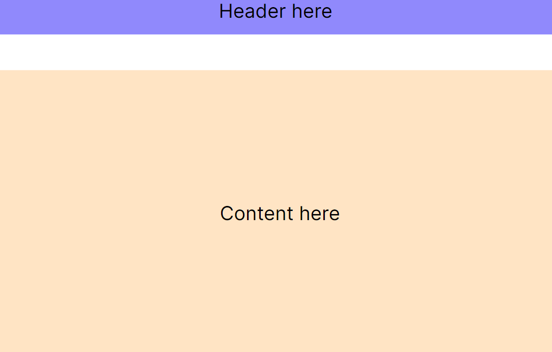
Wait, we have a percentage % unit in CSS and in the following example it makes a header to take a full width of the screen. How is it different from vw and vh ? Percentage units are based on the size of the parent element, while viewport units are always based on the size of the main viewport (screen).
Let's explore few examples on how to build responsive design using vw and vh:
Create a full-screen section with background image that adjusts to the height and width of the viewport:
cssmain {
  width: 100vw;
  height: 100vh;
  background: url("background-image.png") no-repeat center center;
  background-size: cover;
}
Space the elements relative to the viewport size to create a more adaptive layout:
css.container {
  padding: 5vh 5vw;
}
.section {
  margin-bottom: 2vh;
}
Adjust font sizes using viewport units to ensure text remains proportionate across devices, it's tempting to do as follows:
cssbody {
  font-size: 2vw;
}
However using only vw for font sizes can lead to extremely small or large text on very small or very large screen. A common practice is to combine viewport units with clamp() function to set a minimum and maximum font size:
cssbody {
  font-size: clamp(16px, 2vw, 24px);
}
The clamp() function is used to dynamically adjust the font-size of the body element, with three parameters being passed:
- Minimum value: 16px - This is the smallest size the font will be. No matter how small the viewport gets, the font size won't go below 16 pixels.
- Preferred value: 2vw - This value allows the font size to grow and shrink dynamically with the viewport width. 2vw means 2% of the viewport width, making the font size responsive to the width of the screen.
- Maximum value: 24px - This is the largest size the font will be. Even if the viewport width becomes very large, the font size will not exceed 24 pixels.
vmin and vmax are viewport units that represent the viewport's smallest and largest dimensions, respectively.
- vmin: 1vmin is equal to 1% of the viewport's smaller dimension, either width or height. It's incredibly useful for creating responsive elements based on the smallest available space.
- vmax: 1vmax corresponds to 1% of the viewport's larger dimension. It's useful for designs that should scale aggressively in large viewports but need to be constrained in smaller ones.
vmin and vmax can be used to create a content that takes a full width or height of the screen, depending what the smaller value is.
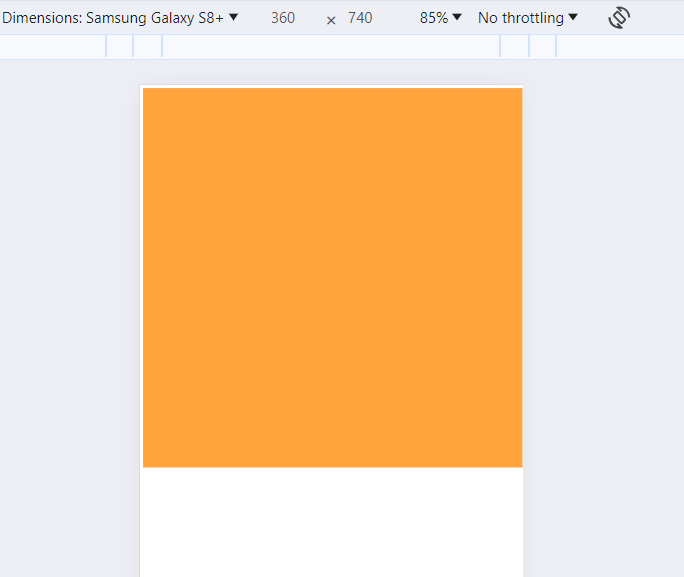
The following CSS will create a square panel equal to the full size of the smallest viewport dimension:
html<style>
    main {
        width: 100vmin;
        height: 100vmin;
        background-color: #ffa33d;
    }
</style>

<body>
    <main></main>
</body>
On a mobile device with screen size of 360x740 this panel will take full width and have height=360px.
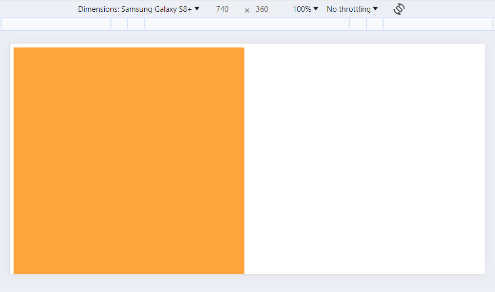
In landscape mode the panel will take the full height and have width=360px.
Imagine you're holding mobile phone in a vertical mode. When you turn it into landscape mode - the screen image rotates and the phone is in horizontal mode.
- vi: This is Viewport inline. 1vi is 1% of the viewport's width in horizontal writing modes and 1% of its height in vertical modes.
- vb: This is Viewport block. 1vb is 1% of the viewport's height in horizontal writing modes and its width in vertical writing modes.
You can create two CSS classes to define adaptive design in horizontal and vertical modes. In horizontal (landscape) mode it scales horizontally: the wider the screen, the wider the block is. In vertical mode it scales vertically: the higher the screen, the higher the block is.
html<style>
.container-horizontal {
    width: 50vi; /* Equals to 50vw */
    height: 50vi;
    background-color: beige;
}

.container-vertical {
    width: 50vb;
    height: 50vb; /* Equals to 50vh */
    background-color: darkseagreen;
}
</style>

<body>
    <div class="container-horizontal"></div>
    <div class="container-vertical"></div>
</body>
Here, horizontal container has square size of 50% of the screen's width everytime and its height is varying depending if the screen has horizontal or vertical mode.
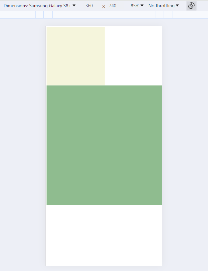
Vertical container has square size of 50% of the screen's height everytime and its width is varying depending if the screen has horizontal or vertical mode.
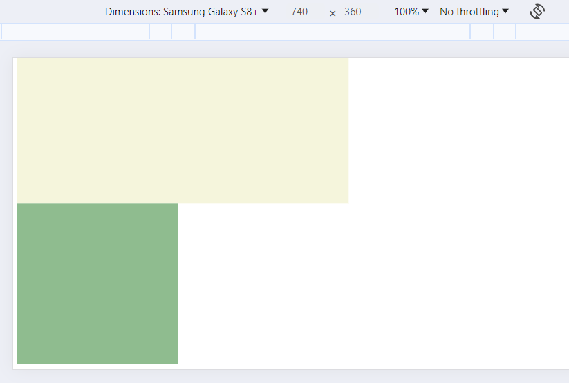
So far we have learned 6 viewport CSS units. Explored viewport units work only for a static viewport size and they can't handle use cases when a viewport size is changing. A perfect example for such a use case is again a mobile phone. Have you ever noticed URL bar disappearing when you're scrolling down the page in the mobile' browser? And it gets back when you scroll up. The viewport's size is changing depending on whether a URL bar is present or not, and sometimes you need to make some slight adjustments in the elements' sizes correspondingly.
Here come s, l and d viewport modifiers to a rescue.
- s: This is Small viewport modifier. This is the size of the viewport when the URL bar is shown.
- l: This is Large viewport modifier. This is the size of the viewport when the URL bar is hidden.
- d: This is Dynamic viewport modifier. This is the current size of the viewport that changes depending if the URL bar is shown or not.
You can add these modifies as prefix to an existing viewport CSS units:
css.container-small {
    /* Equals to 100vh of screen height when the URL bar is shown */
    height: 100svh;
}

.container-large {
    /* Equals to 100vh of screen height when the URL bar is hidden */
    height: 100lvh;
}

.container-dynamic {
    /* Equals to 100vh of screen height regardless if URL bar is shown */
    height: 100dvh;
}
You can combine s, l and d modifiers to get all 24 viewport CSS units:
- vw, svw, lvw, dvw
- vh, svh, lvh, dvh
- vi, svi, lvi, dvi
- vb, svb, lvb, dvb
- vmin, svmin, lvmin, dvmin
- vmax, svmax, lvmax, dvmax
Viewport CSS units is a great tool for developing responsive designs. They allow for fluid scaling of layout, typography, and spacing that ensures that web content looks good and functions well, no matter the screen size.
Viewport units like vw, vh, vmin and vmax are most commonly used. Consider using a clamp() function that limits the minimum and maximum size of an element on very small and very large screen sizes.
Viewport units like vi, vb and viewport modifiers s, l, d are used in some niche use cases but are a great addition to the web developer's toolkit.
This feature is highly supported by all modern web browsers:
Hope you find this newsletter useful. See you next time.
