
Responsive design ensures that web content looks good and functions well, no matter the screen size. Such design is a must-have in modern web applications.
In today's post you will learn how to use CSS Media Queries to build responsive web designs.
How To Create CSS Media Queries
CSS Media Queries allow developers to apply CSS styles based on the characteristics of the device rendering the content.
A media query consists of a media type and one or more expressions that can be combined with logical operators. These expressions check the conditions of particular media features, such as width, height, or orientation of the viewport.
You can define a Media Query inside a CSS file using the following syntax:
css@media not|only mediatype and (expressions) { CSS-Code; }
For example, we can create a Media Query that applies styles for screens that have width less than 640px:
css@media only screen and (max-width: 640px) { body { font-size: 16px; } }
The media type can be one of the following:
- screen - screens
- print - paged material and documents viewed on a screen in print preview mode
- all - suitable for all devices
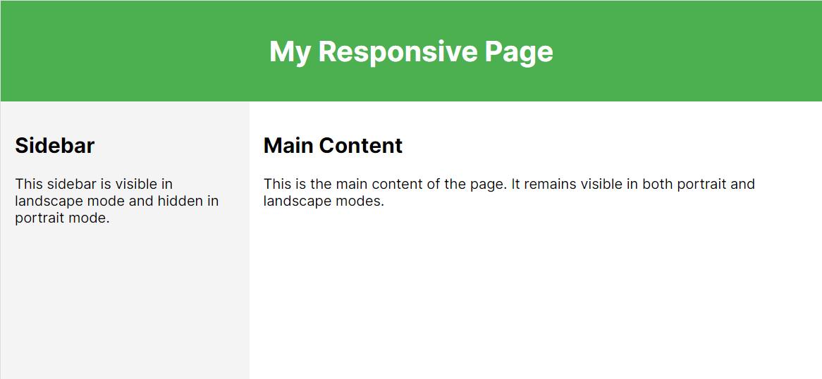
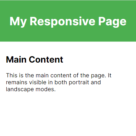
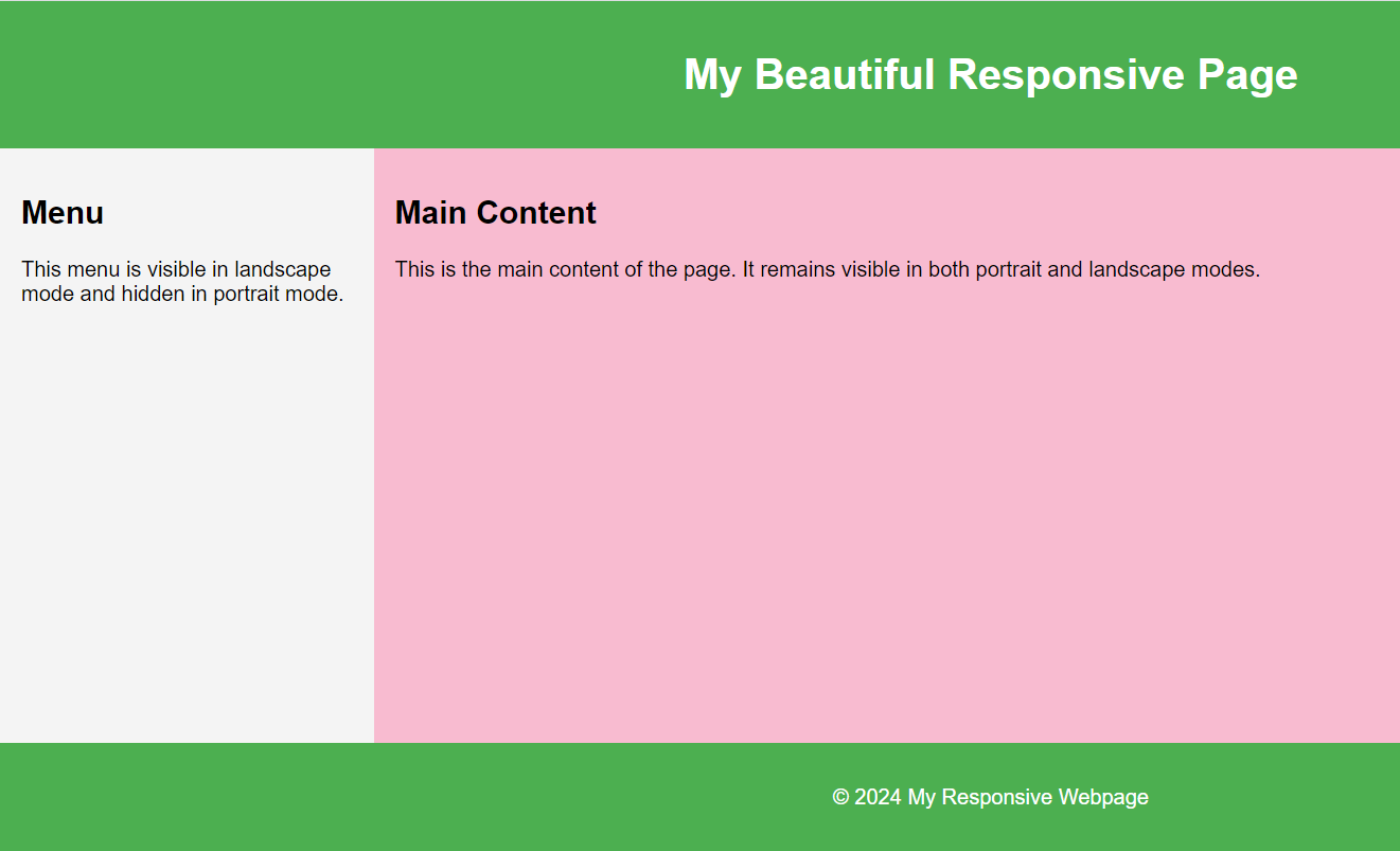
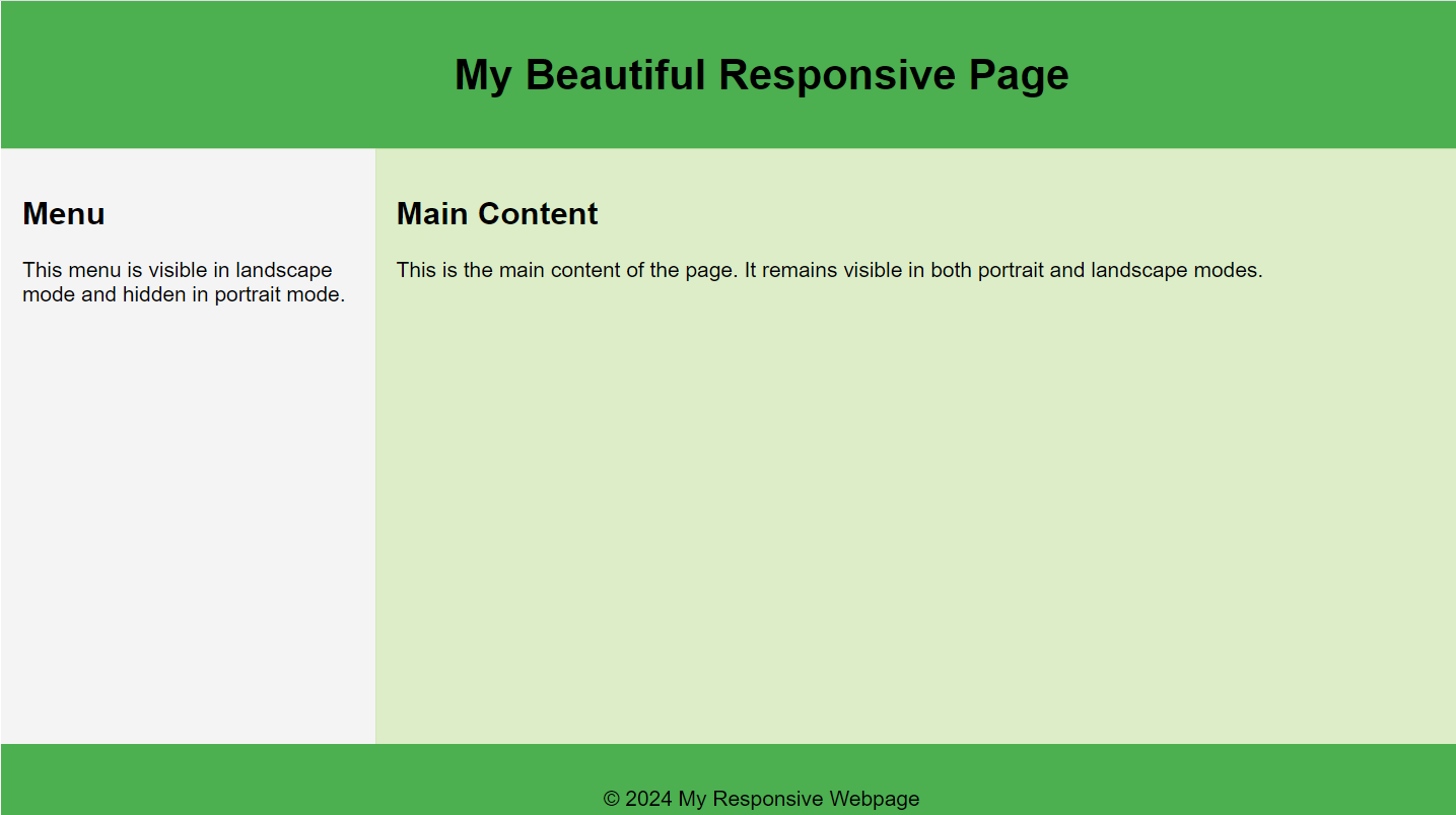
CSS Media Queries for different orientations
You can create two separate Media Queries for different screen orientations. It is particularly useful when you want to hide some elements or show them differently in landscape or portrait modes:
css@media screen and (orientation: landscape) { .sidebar { display: block; } } @media screen and (orientation: portrait) { .sidebar { display: none; } }
Landscape mode:
Portrait mode:
Combining Multiple Media Queries
You can combine multiple Media Queries with logical operators: and, or, not, only. Only applies styles exclusively to certain media types.
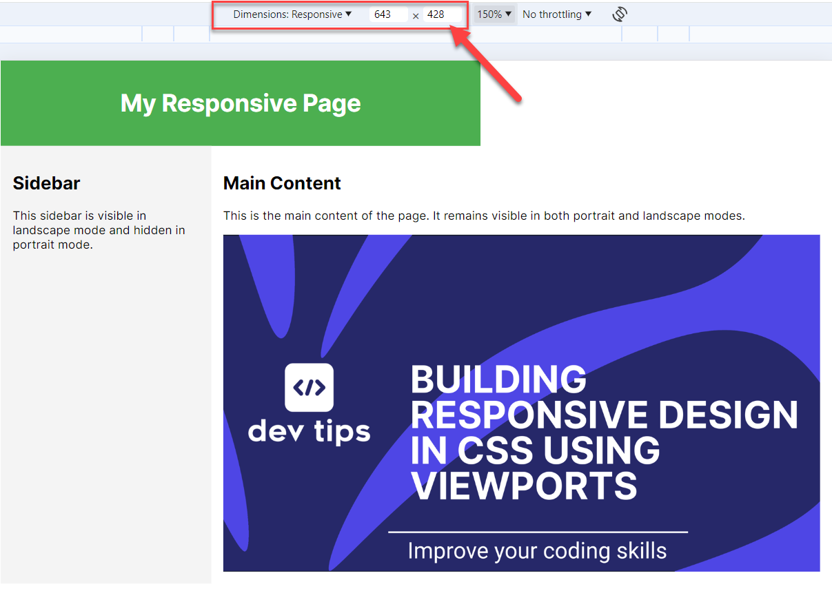
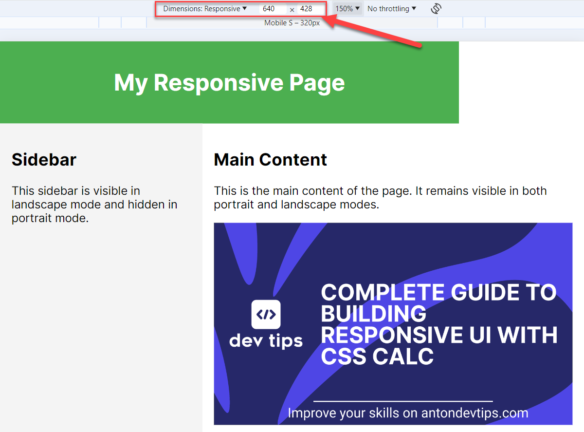
Let's explore an example of how to change an image based on the width of the screen:
css@media screen and (min-width: 480px) and (max-width: 639px) { .image { background-image: url("image_small.png"); width: 500px; height: 281px; } } @media screen and (min-width: 640px) { .image { background-image: url("image_big.png"); width: 800px; height: 452px; } }
In the first Media Query we show a small image when the width of the screen is from 480 to 639 pixels. For a wider screen - we show a bigger image.
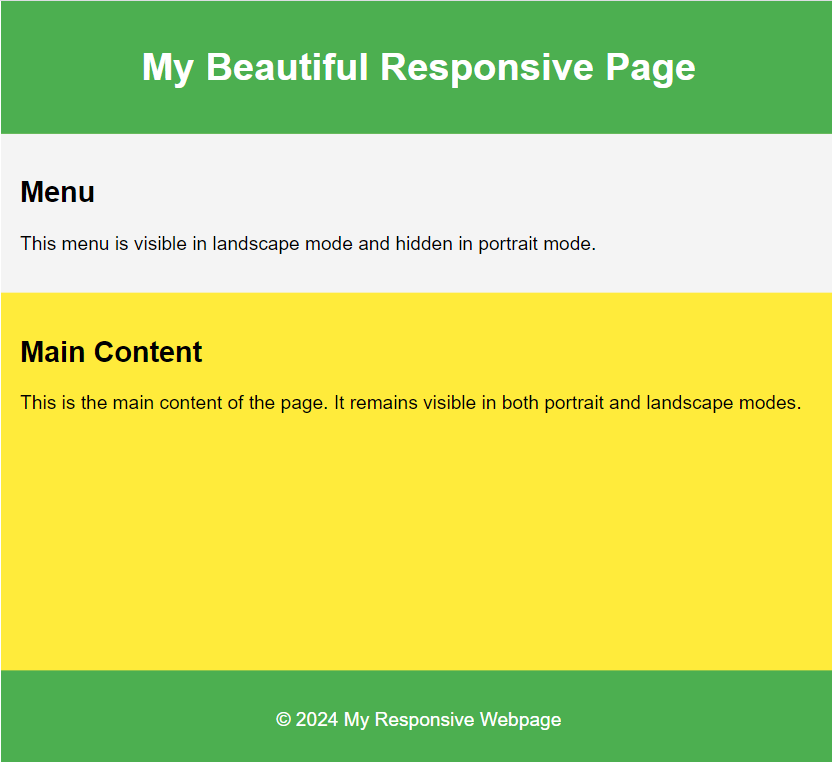
Let's explore another example of a webpage that has different styles for every typical device breakpoint: mobile, tablet, laptop, large screen, etc. For simplicity, we will just change the background color of the page:
css/* Default (Mobile devices, typically 0px to 480px) */ body { background-color: #f4f4f4; } /* Small devices (Tablets, 481px to 768px) */ @media (min-width: 481px) and (max-width: 768px) { body { background-color: #ffeb3b; } } /* Medium devices (Landscape tablets, 769px to 1024px) */ @media (min-width: 769px) and (max-width: 1024px) { body { background-color: #03a9f4; } } /* Large devices (Desktops, 1025px to 1200px) */ @media (min-width: 1025px) and (max-width: 1200px) { body { background-color: #8bc34a; } } /* Extra large devices (Large desktops, 1201px and above) */ @media (min-width: 1201px) { body { background-color: #e91e63; } }
Media Queries Level 4 Capabilities
Media Queries Level 4 specifies a new and simpler syntax using less then (<), greater than (>) and equals (=) operators.
You can use this new syntax for more compact expressions:
css/* Apply styles for devices with a viewport width between 30em and 80em */ @media (30em <= width <= 80em) { body { background-color: lightblue; } } /* Apply styles for devices with a viewport height between 40em and 90em */ @media (40em <= height <= 90em) { body { background-color: lightgreen; } } /* Apply styles for devices with a resolution between 1.5dppx and 3dppx */ @media (1.5dppx <= resolution <= 3dppx) { body { background-color: lightgoldenrodyellow; } }
Not and Only Logical Operators
The not operator is used to negate a media query. This means that the styles will be applied to devices that do not match the specified conditions.
For example, the styles inside the media query will be applied to all devices, except those with a width between 30em and 80em:
css@media not (30em <= width <= 80em) { body { background-color: lightgray; } }
The only operator is used to apply styles exclusively to devices that match the specified media type and conditions. It is often used to prevent older browsers that do not support media queries from applying the styles:
css@media only screen and (30em <= width <= 80em) { body { background-color: lightblue; } }
Nested Media Queries
One of the most powerful features of Media Queries is that you can create nest queries.
For example, you can have a sidebar menu that occupies the full width on the small screens. While on the tablet screens it is shown in the landscape mode and hidden in the portrait.
Instead of having 3 Media Queries: 1 for smaller screens and 2 for a tablet screen, you can create a nested Media Query that handles orientations:
css@media (481px <= width <= 768px) { .sidebar { width: 100%; } } @media (769px <= width <= 1024px) { @media (orientation: landscape) { .sidebar { display: block; } } @media (orientation: portrait) { .sidebar { display: none; } } }
Here an orientation media query is nested inside a main media query defined for the screen width.
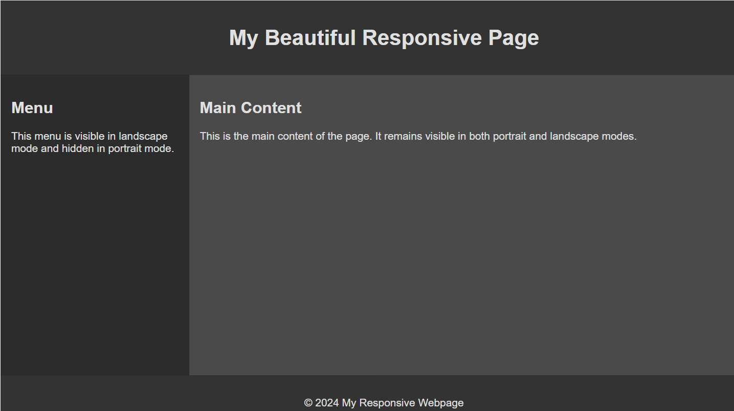
Create Light and Dark Theme Using Media Queries
You can use CSS Media Queries to create light and dark theme for your website.
All you need to do is to create a Media Query with prefers-color-scheme and reassign the CSS variables:
css/* Default Styles (Light Theme) */ :root { --background-color: white; --text-color: black; --header-footer-background: #4CAF50; --sidebar-background: #f4f4f4; --content-background-light: #e3f2fd; --content-background-dark: #dcedc8; } @media (prefers-color-scheme: dark) { :root { --background-color: #121212; --text-color: #e0e0e0; --header-footer-background: #333333; --sidebar-background: #2c2c2c; --content-background-light: #383838; --content-background-dark: #4a4a4a; } }
Best Practices for Using Media Queries
1. Mobile-First Approach: Design for the smallest screen sizes first and progressively enhance the design for larger screens. This approach often leads to cleaner, more focused designs that are easier to expand for larger screens.
2. Use Relative Units: Use relative units like em, rem, %, and vw/vh for sizing elements. Relative units adapt better to different screen sizes and user settings.
3. Minimize the Number of Breakpoints: Use only as many breakpoints as necessary to achieve a responsive design. Too many breakpoints can make your CSS complex and hard to maintain. Also, using many media queries can have an impact on performance.
4. Combine Media Queries: Group media queries to avoid repetition and reduce CSS file size. This practice keeps your code DRY (Don't Repeat Yourself) and more maintainable.
5. Use Media Queries for More Than Just Layout: Apply media queries for typography, images, and other UI elements. Enhancing all aspects of the UI for different devices improves the overall user experience.
6. Avoid Fixed Breakpoints Based on Specific Devices: By fixed breakpoints, I mean setting the exact width or height. Use generic breakpoints instead of targeting specific device sizes. This makes your design more future-proof and adaptable to new devices.
css/* Generic breakpoints */ @media (min-width: 480px) { /* Small devices */} @media (min-width: 768px) { /* Tablets */} @media (min-width: 1024px) { /* Desktops */}
7. Test Across Devices: Regularly test your design on real devices and emulators. Ensuring your design works well across a variety of devices helps catch issues early and improve user experience.
Hope you find this newsletter useful. See you next time.
